


SwipeJobb is a startup business and employment-focused social media platform that works through mobile apps. This app focus on the business such as restaurants, cafes, hotels, cleaning companies, etc to find, match and hire them as a part-time, full-time or internship.
Since the app was designed by different designers in different time periods, it was quite inconsistent with many usability issues. I redesigned the app in over 150 pages, both in dark mode and light mode.
The purpose of redesigning this app was to increase its usability.
Our Team: 1 UX/UI designer. 3 App developers. 2 Backend developers. 4 Sales & marketings. 1 Graphic designer/content creator. 1 HR. 1 CTO. 1 CEO
Attention: All the research cannot be shared due to privacy reasons.
Improving Usability of Swipejobb App
Project Information
01. Duration
24 Weeks
02. Screens
+150
03. My Role
UI/UX designer
04. Tools
Problem Statement
-
Low rating on app store and google play store and having bad reviews.
-
Multiple usability issues and bugs that impacted the user task success rate.
-
App downloads had decreased and accounts had been deleted because of the unfriendly app.
-
Low KPI score because of the mobile app issues.
Our Goal
-
The primary goal is to improve the overall usability of the app by addressing and resolving identified usability issues. This includes a focus on creating an intuitive and seamless user interface to enhance user satisfaction.
-
Implement a user-centered design approach to ensure the app aligns with user expectations and preferences. Conduct user research and usability testing to gather valuable insights for informed design decisions.
-
Simplify the onboarding process to make it user-friendly, reducing the likelihood of account deletions. Ensure that new users can easily navigate through the app and understand its features without encountering obstacles.
-
Conduct regular usability testing throughout the development process to identify and address potential issues before they impact users. Iterate on the design based on user feedback and testing results to continuously enhance usability.
-
Define and track key performance indicators such as user retention, engagement, and satisfaction scores. Establish a plan to consistently improve these KPIs by addressing identified usability issues and continuously enhancing the app.
Pain Points
-
Businesses Pain Points: The high volume of resumes received in the business account is not classified correctly. Businesses cannot easily find the resumes they want.
-
Job seekers Pain points: Lack of filtering makes it difficult for job seekers to find what they are looking for. In the absence of saving the resume in the account, users have to upload their resume each time and fill out the application, which takes time.
Design Process
-
Usability testing
-
Heuristic evaluation
-
User persona
-
Journey map
-
Ideation
-
Prioritization of usability improvements
-
Visual design
-
Iteration
Usability Testing
To validate my observations, I began my research with usability tests. I conducted moderated tests on Google Meet with 24 diverse users (12 businesses and 12 job seekers), as our goal of redesign was to make the app friendly for our old users and engage and attract new users, I choose our participants in both new and existing ( 2 participants had disabilities) . I simulate real-life scenarios with 5 tasks and 6 questions. Participants were asked to share their screens, allowing me to observe their navigation between pages and find out how easy it is to use the app.
Attention: All the research cannot be shared due to privacy reasons.
The results of our interview with 4 participants were as follows:

Existing pains:
-
Users found the design too messy, and they were distracted with colors and inconsistent design.
-
The app wasn’t inclusive and accessible for all the users specially users with disabilities. They mentioned that the distance between their home to work is really important for them, and it is really hard to communicate for interview process.
-
Even our old users weren’t familiar with apps features and they were confused by some of our tasks.
Heuristic Evaluation
After conducting usability test I realized that one of our main problems was with user interface (UI) design. So I used Heuristic evaluation to identify usability problems in apps interface design.To conduct the heuristic evaluation I first familiarize myself with a set of usability heuristics Then, I'd systematically review the app interface, noting any potential issues and finally, I prioritize the identified problems.
Here you can see the results of Heuristic evaluation in a chart and a curve. Base on this results I discovered the areas of our major and critical UI problems.


Heuristic Results


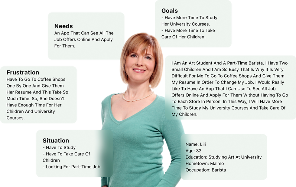
User Personas
Based on the chart we looked at earlier, I noticed many big issues with accessibility. Not only that, but in our usability tests, our users faced accessibility problems too.
So I found this problem critical and I decided to create personas to empathize with users.
I wanted to really understand what are our users goals, frustrations, Needs, and thoughts. That's why I've created four different user personas. Two are for job seekers, and the other two are for businesses. This way, I covered all our target users and could design with them in my mind.

User Journey
To understand how personas interact with our app over time, identify their potential pain points, and find opportunities for improvement, I chose to create a user journey. This involved first understanding the personas' backgrounds, needs, and frustrations. Then, I mapped out their interactions with the app, considering their goals, experiences, feelings, pain points, and opportunities for improvement at each step. You can see one of the user journeys below:

Our Ideation
I wrote all of my ideas on sticky notes, our team's developers also contributed ideas to my brainstorming session.
After that I gathered all the sticky notes and pinned similar ones to each other.
During reading of our team members ideas, I found new ideas and wrote them in a separate sticky notes.
After arranging all the sticky notes in FigJam, we set a meeting to find out our priorities, and discussed how to create our MVP.

Our MVP
After arranging all the sticky notes in FigJam, we set a meeting to find out our priorities, and discussed how to create our MVP. During a collaborative session with our developers and stakeholders, we prioritized our ideas using an effort-impact matrix. We focused on ideas that required low effort but promised high impact, selecting the most efficient and effective solutions for development.
.png)
Design System
As previously mentioned, We had many problems in our UI design so I redesigned the design System for consistency in elements in the second step. Here you can see part of our design system.

WireFrames
In the following, you can see some of the low fidelity prototype pages of the application that I designed for layout the basic structure of the app base on our MVP.


Iteration
I conducted a comprehensive usability test for our project, evaluating the user interface and overall functionality. The feedback received provided valuable insights, enabling us to refine and enhance the user experience for optimal usability and satisfaction. In the following list, you can see a few of them
The main button of the app confused users. Users did not understand what happens with QR scanning and what capabilities this button has. For this reason, we changed the name of this button to make it more understandable for users.
The home page is the heart of our software with many features. In the usability test, users checked a series of buttons with thought and error test. For this reason, we decided to have a short tutorial at the beginning of entering the home page for the first time so that users can familiarize themselves with all the features of this page.
Before usability test
After usability test


Before usability test
After usability test
During usability testing, we discovered that users wanted to be able to filter job openings based on location in addition to seeing job positions on a map, which is why we added the location filter option in the filter section. Additionally, for ease of use, we added the option of drawing a line around the map's desired points.
Before usability test

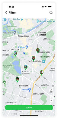
After usability test
After usability test

My Reflections
My Insight:
SwipeJobb was a great project with rewards and challenges.
I always liked to work in a startup as I wanted to face many challenges and be able to gain valuable experiences.
opportunity to holistically redesign the SwipeJobb app not only improved its usability but also shaped my perspective on the dynamic nature of design in startup environments.
My Challenges:
Being the sole designer meant that I had to generate and refine ideas independently also, managing the entire design process, from research and wireframing to prototyping and testing, was a demanding task.
What I did differently:
Innovations involved the implementation of a unique user engagement feature to foster community interaction within the app, designing illustrations element to enhance user motivation and participation which was implemented outside the main purpose of the redesign.
Accessibility Considerations
Adding alt text enhances accessibility by providing descriptive text for images, ensuring users with visual impairments can navigate the app effectively through screen readers.
Using icons enhances accessibility by providing visual cues, aiding users with diverse needs in easily interpreting functions within the app.
Coach mark in the app act as an accessibility aid, guiding users through key features with interactive tooltips to enhance user understanding and engagement.
Dark mode enhances accessibility by providing a visually comfortable and low-light-friendly interface, reducing eye strain and improving readability.
Map integration enables location-based job searches, simplifying the process for users with disabilities to find and apply for opportunities closest to their homes.
Takes away
Impact:
Promoted and implemented a user-centered design, resulting in improved user satisfaction and engagement.
Increased conversion rates by 43% through UX & UI enhancements.
Implemented accessibility standards, making the product more inclusive with WCAG guidelines.
Designed solutions that reduced user errors by 90%, enhancing overall usability.
One quote from feedbacks:
I think it seems very useful. With this tool, I can find a job more easily and efficiently, which will save me a lot of time. This extra time can then be spent with my family and friends, enhancing our relationships and overall quality of life. Additionally, I can find a good job that is conveniently located near my home. This not only reduces commuting time and expenses but also allows me to maintain a better work-life balance.
What I learned:
Iterating on Swipejobb's design taught me the importance of adaptability and responsiveness to user needs. By continually refining and enhancing the app based on feedback, we were able to create a product that truly resonated with our target audience, ensuring a seamless user experience and greater overall satisfaction.